Using Graphs
Oct 1, 2009
Have you ever heard the saying "numbers can't lie?" Ha! One of the most effective ways to tell a lie with numbers is to graph them and then alter the axes on a graph. Most people, even the best informed, fall for this trick. Today's discussion is a great example of telling a lie -- probably inadvertently -- by misusing graphs.
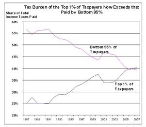
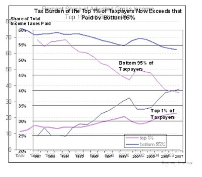
Here is a graph showing the growth in the amount of taxes paid by the top one percent of the population:
This looks really unfair to the top one percent of taxpayers -- if this goes on much longer, they'll be paying all the taxes and everyone else will get a free ride!
The above graph appeared recently in a blog in the New York Times. One reader immediately pointed out:
-
This could be the least surprising graph ever posted. When the top 1% increases its wealth faster than the bottom 95%, then yes, its share of income taxes paid will also increase.
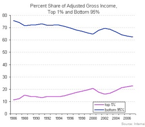
Good point. The blog's author kindly responded by posting a second graph, showing the increase in wealth over the same period:
Thanks to the reversal of colors in the two graphs, they can be confusing to compare (not a deliberate deception -- the graphs were from two different sources). Here's the key:
-
*In the top (tax share) graph, the pink line represents the bottom 95% of taxpayers and the blue line represents the top 1% of taxpayers.
-
*In the bottom (income share) graph, the line colors are reversed: pink line represents the top 1% of income-earners and the blue line represents the bottom 95% of income-earners.
But once we get that straight, it is tempting to conclude that there has been only a modest increase in the share of total income, while the share of taxes has increased dramatically.
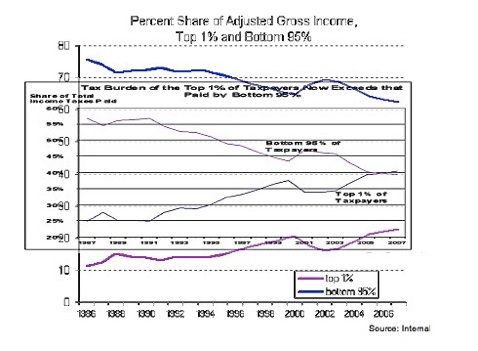
More dramatically, here are the two graphs, one imposed on top of the other:
Ignore the colors -- they're still deceptive: the top two lines (decreasing income and decreasing taxes) represent the bottom 95% and the bottom two lines (increasing income and increasing taxes) represent the bottom 1%. Obviously, the share of the taxes paid has grown much faster for the top 1% than their share of the income!
Or has it?
There's a classic problem with comparing the above graphs, which is that the scales on the two graphs are not the same. If you look very carefully, you'll see that the tax graph has more years in the same number of inches than the income graph and fewer percentage points. In fact, instead of showing percentages from 0 to 100, the tax graph only shows percentages from 20 to 60. This compresses the x-axis and stretches the y-axis -- with the effect of making the slope of both lines on the tax graph more extreme than the corresponding lines on the income graph.
Here's a comparison with axes adjusted to the same size, which should give you a better feeling for the degree of exaggeration involved:
See how different the shape of the tax graph is now, from the earlier square shape. Also, the slope of the lines tells a totally different story. Eyeballing it, the income share and tax share lines track each other pretty well. Attempting to read numbers, it appears that the income share of the top 1% has gone from about 11% to about 22% (just about doubled), while the tax share has gone from 25% to 40% (didn't quite double).
That's a different story altogether.
Perhaps the saddest part of this story is that this was probably a completely accidental deception and the blogger was simply trying to inform her readers. Indeed, she took the pains to find and post the income graph (these are not so easy to find, I've looked for them, unsuccessfully, myself) after the reader posted his comment. All the graphs were probably created with Excel, which is a wonderful tool for manipulating and understanding numbers -- if the user realizes that it seems to try to make the graphs look pretty rather than to make them easy to read accurately.
However, this experience can make us wiser in two important ways:
-
*When comparing graphs, make sure the axes are identical.
-
*Always be suspicious of a graph that has the vertical axis cut at arbitrary points (20 to 60 instead of 0 to 100).
Lying with Graphs